Reference
Page Designer Block Library
The Page Designer lets you build a custom public-facing event website without writing code. The page is assembled from content blocks — drag-and-drop sections that render different types of content. This reference describes every available block type, its settings, and when to use it.
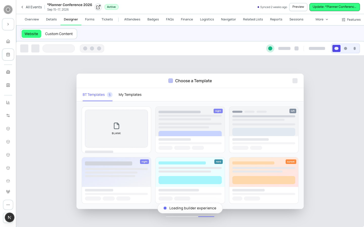
How Blocks Work
Blocks are added from the block palette on the right side of the Page Designer. Each block renders a self-contained section of the page. Most blocks pull live data from Salesforce — for example, the Speakers block renders content from conference360__Speaker__c records, so adding a new speaker in Forge automatically updates the page.
Content Blocks
| Block | What it renders | Key settings | Data source |
|---|---|---|---|
| Hero | Full-width banner with a headline, subtitle, and a call-to-action button | Background image, headline text, subtitle text, CTA label and URL, overlay opacity | Static — text is entered in the block settings |
| Text | A rich-text content section with optional heading | Heading, body content (rich text editor), max width | Static — text is entered in the block settings |
| Image | A single image with an optional caption and link | Image upload, alt text, caption, link URL, alignment (left/center/right) | Static — image is uploaded in the block settings |
| Video | An embedded video player (YouTube or Vimeo) | Video URL, autoplay, muted, show controls | Static — URL is entered in the block settings |
| Countdown | A live countdown timer to the event start date | Label text, date/time override (defaults to event start) | Dynamic — reads conference360__Event_Start_Date__c |
| FAQ | An accordion of question-and-answer pairs | Q&A pairs defined in the block; expand-all option | Static — Q&A items are entered in the block settings |
| Custom HTML | Renders arbitrary HTML/CSS/JS in an isolated block | HTML content, container max width | Static — use with caution; must not inject sensitive data |
Event Data Blocks
These blocks automatically pull live data from Salesforce and update whenever the underlying records change — no need to re-publish the page.
| Block | What it renders | Key settings | SF data source |
|---|---|---|---|
| Schedule / Agenda | A session-by-session agenda grouped by day and time | Show session tracks, show session room, show speaker thumbnails, time format (12h/24h) | conference360__Session__c |
| Speakers | A grid of speaker cards with photo, name, title, and company | Number of columns (2/3/4), show bio on hover, filter by confirmation status | conference360__Speaker__c |
| Sponsors | Sponsor logos arranged by level/tier | Show sponsor name beneath logo, levels to display, logo max height | conference360__Sponsor__c |
| Ticket Pricing | A table of the event's ticket types and prices | Which items to show, price display format | conference360__Event_Item__c |
| Pricing Summary | A compact card showing the event's starting ticket price | Label text, currency display | conference360__Event_Item__c |
| Register Button | A button that links out to registration or checkout | Button label, destination (registration page or checkout) | Links to the existing checkout route — not a data-bound block |
| Event Checkout | Inline ticket selection, cart, and checkout embedded directly on the page | Which items to offer, waitlist behavior | conference360__Event_Item__c + checkout route |
| Location Card | The event's venue with an embedded map, directions link, and website link | Show directions button, show website link | conference360__Venue_Name__c / Venue_Street__c / Venue_City__c / Venue_State_Province__c / Venue_Postal_Code__c fields on the Event |
Layout Blocks
| Block | What it renders | Key settings |
|---|---|---|
| Section | A full-width container for grouping other blocks | Background, padding, container width |
| Column | A layout column inside a Section — add two or more side by side to build multi-column layouts | Width, stack on mobile |
| Tabs | A tabbed container that shows one child group of blocks at a time | Tab labels, default active tab |
Block Styling Options
Every block shares a common set of styling controls in the block settings panel:
- Background color — solid color or transparent (inherits the page background)
- Background image — with position, size, and repeat controls
- Padding — top and bottom (in px or rem units)
- Container width — full bleed or contained (max-width set by the event theme)
- Text alignment — left, center, or right
- Anchor ID — a custom slug used for #anchor deep-links in navigation and CTA buttons
Theme inheritance
Block colors and typography default to the event's active theme. Override individual blocks in their settings without changing the global theme — useful for creating a hero section that stands out from the rest of the page.
Page Settings
In addition to individual block settings, the Page Designer includes page-level settings accessible from the top toolbar:
| Setting | What it controls |
|---|---|
| Page Title | The browser tab title and og:title for social sharing |
| SEO Description | The meta description used by search engines and social sharing previews |
| Favicon | A custom favicon for the event page |
| Open Graph Image | The preview image shown when the event URL is shared on social media |
| Custom CSS | Event-specific stylesheet rules that override theme defaults; applied after all other styles |
| Analytics Code | Google Analytics measurement ID or custom analytics snippet injected into the page head |
Page Designer data is live
Blocks that pull Salesforce data (Speakers, Sponsors, Schedule) are rendered in real time on every page load. There is no 'publish' step for content changes — adding a speaker or updating a session title is reflected immediately on the live page.